HammerAlbrecht
Webdesign & Prototyping
→
Icarus Creative built a bridge between sound, words and visuals for Voice, a speech and voice training company run by Verena Covi, and inspired by language and sound. I was asked to help to expand the already existing concept in its entirety.
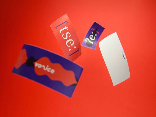
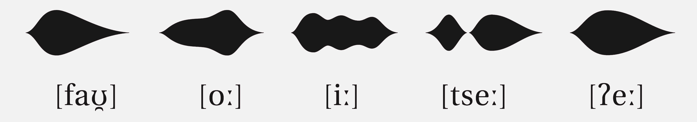
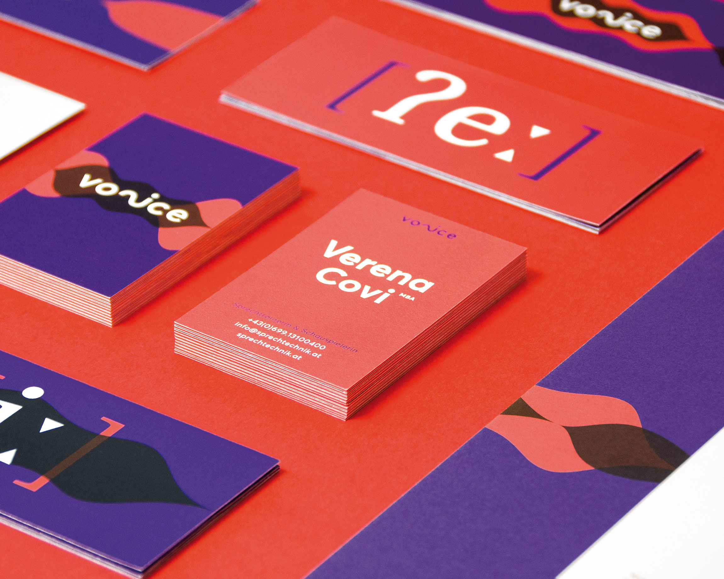
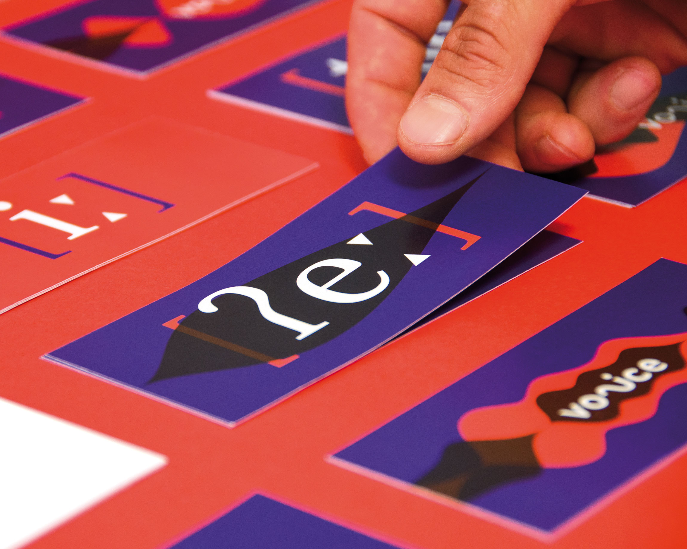
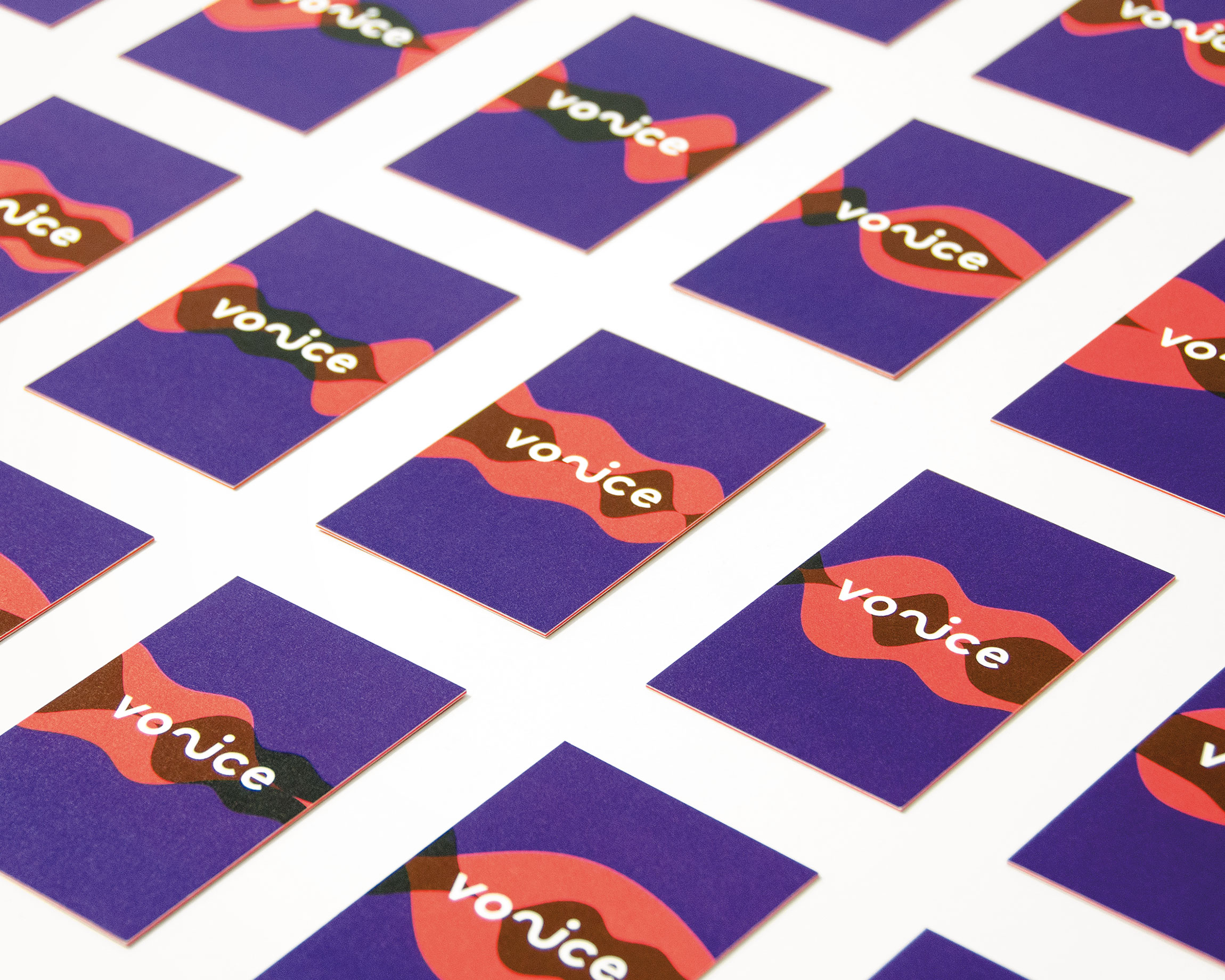
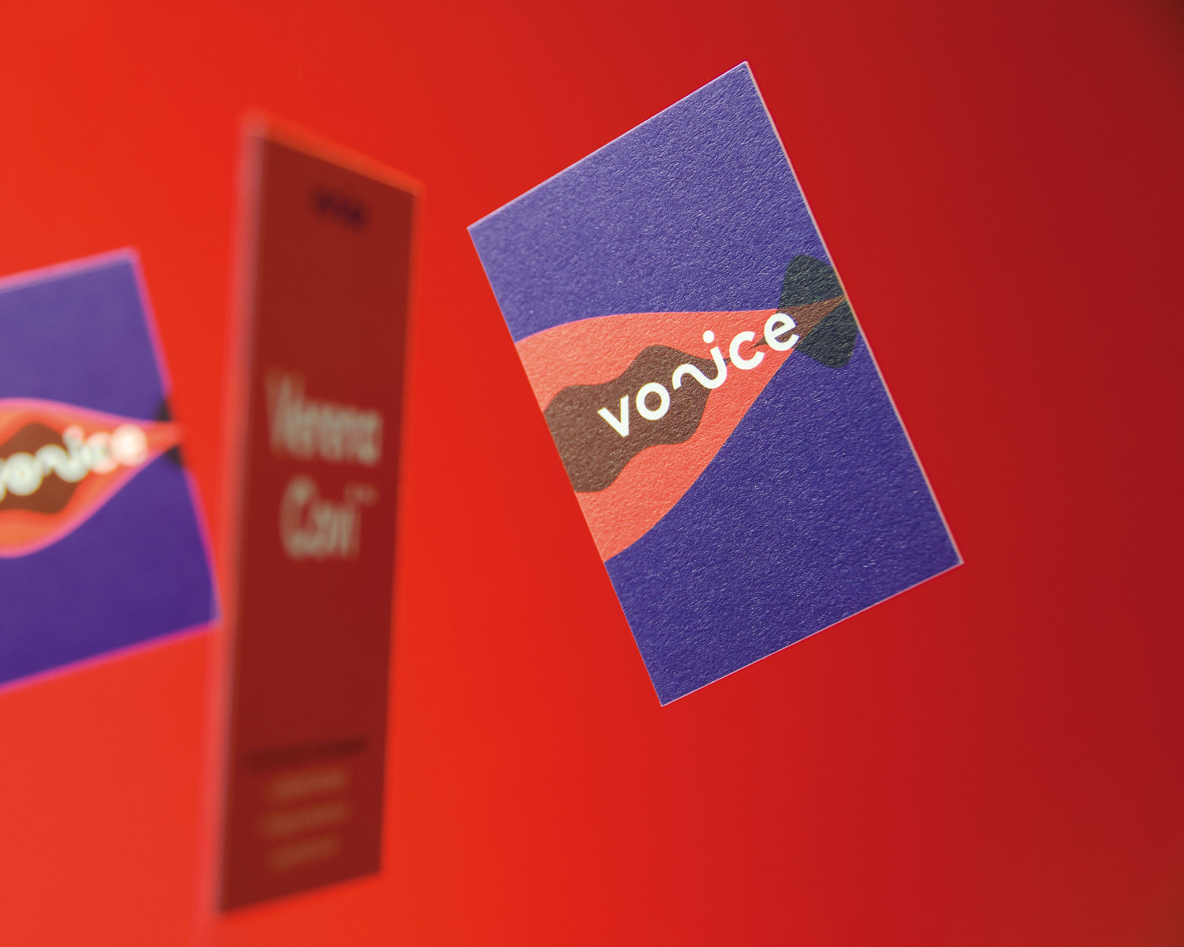
The basis of Voice’s corporate identity comes from the visualisation of audio waves, which symbolise the versatility of language, pronunciation and intonation. These waves, in their simplified form, can be dynamically translated into any medium – print, digital, sound, and so on. To represent the diversity of language and the audio waves, business cards with 50 mutations had been created. Digitally, the visitor is given playful access to speech technology via the website. Certain words have been highlighted with the body text, encouraging visitors to click on them and discover what happens. The listener is rewarded aurally with an audio sample, and visually as animated audio waves move rhythmically to the spoken word.
Voice’s corporate design also makes use of phonetics, the teaching of linguistic sound, as an important design element. Finally, the colour world also plays an important role. Memorable intense violet and orange tones complete the branding for Verena Covi’s elocution technique.
We defined the brand’s target audience as people who are aware of the meaning and effect of voice and language, and who want to develop or optimise their potential through this field. The brand representation should convey the importance of voice and language, whilst making in unmistakably tasty. Elocution’s image should no longer be tired or dusty, but sensual and desirable.
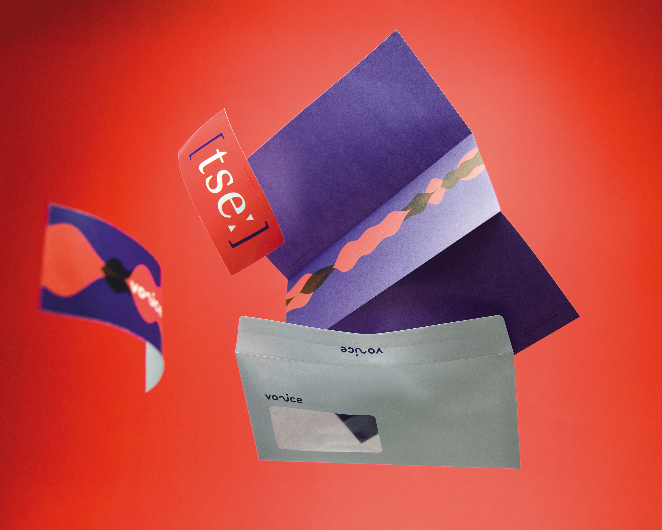
During my time at ICARUS Creative, I was asked to expand the beautiful visual concept together with them. The corporate design was already dynamic, so we decided to push the boundaries even further by utilising the audio wave concept. To achieve this, we removed the lettering, and combining the audio waves only with phonetics.
By using phonetics unusual letterforms – that we traditionally see only in dictionaries to define a word’s pronunciation – we can create incredibly strong and communicative word forms. For this reason, we exchange phonetic letterforms with the logo, making them a new and important part of the overall brand identity.
We then wanted to bring the brand to life, so we used the waves as an equaliser on the website. We asked Verena Covi herself to record some complex words from the text. Visitors could now listen to her voice when they click on the speaker symbols next to these words. At the same time, the audio waves provide a visual of her voice. This gave the website a playful, interactive layer, creating an exciting experience for users as they read through the website.
Last but not least, we photographed the project, ensuring it was be as powerful and as joyful as Verena Covi, and the overall branding we created for her.
Webdesign & Prototyping
Corporate Design
Webdesign
Corporate Design
Corporate Design
Webdesign & Development